Wedding website examples: 20 real sites
Written by the Wedvite foundersPrices checked 15 September 2026
The twenty examples below are live wedding websites you can open on your phone, not screenshots. Each one puts the couple's names, the date and the RSVP on the first screen, then keeps schedule, venue and travel in plainly labelled sections. Open two, scroll both, and pick the one that still reads clearly on the second visit.
Every example on this page is one of our own designs, shown with a real screenshot of its first screen and linked to a live demo you can scroll. Three of the four services in the comparison below give a wedding website away free; we do not, and the table says so. If you want the invitation and the site to be the same link, that is what our wedding website builder does: digital wedding invitations from $89 flat, unlimited guests, RSVP included.
What makes a wedding website example work?
The same five things, in every style. The first screen answers who and when, so nobody scrolls past a decorative introduction to find the date. The reply action is visible near the top and again at the bottom, because guests read once and act later. Practical sections use plain labels — Schedule, Venue, Travel — instead of clever ones. The narrow-screen version is the real version, since most guests arrive from a message on a phone. And the link keeps working: a changed time or a new photograph should reach everyone on the same URL, with nothing re-sent.
Two things separate a website that looks good from one that works. The first is contrast — a dark or heavily painted design has to keep the date and the address at full legibility, which is why the two dark designs below, Deco and Aurora, keep their timings on plain panels. The second is order: welcome, details, schedule, venue, travel, photographs, RSVP. Guests who already know you skim to the middle; guests who are travelling read the whole thing. Both should be able to.
If you want the complete content list rather than the design argument, our checklist of what to include on a wedding website covers every section and how to word it, and the online RSVP page explains how replies, meal choices and guest messages come back to you. For the one section on every design that has to be written from scratch, there are eight complete our story examples you can copy in full.
20 wedding website examples you can open right now
Twenty designs, grouped by the kind of day they suit. Each card shows the first screen a guest sees, one line on why it works, a link to the live site and a link to the design page. They are demonstrations, not other couples' private invitations, so you can open every one without reading somebody else's guest list.
Classic and formal wedding websites
These five are built for a ballroom, a grand hotel or a black-tie dress code. The opening sets the level of formality, then the information blocks turn deliberately plain so nobody has to decode a timing.
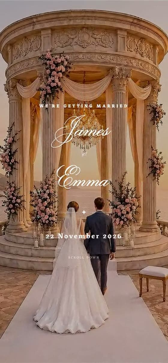
Classic · formal · black tie
Royal
Why it works: Ivory and gold announce a formal evening before a word is read, and the dress-code note sits in its own labelled block instead of being hidden in a paragraph.
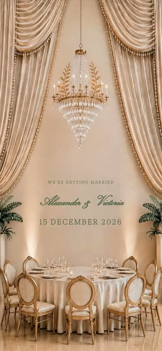
Luxury · ballroom · ornate
Imperial
Why it works: The chandelier arrival carries a large guest list, then cream information cards keep transport, itinerary and RSVP deadline readable at arm's length.
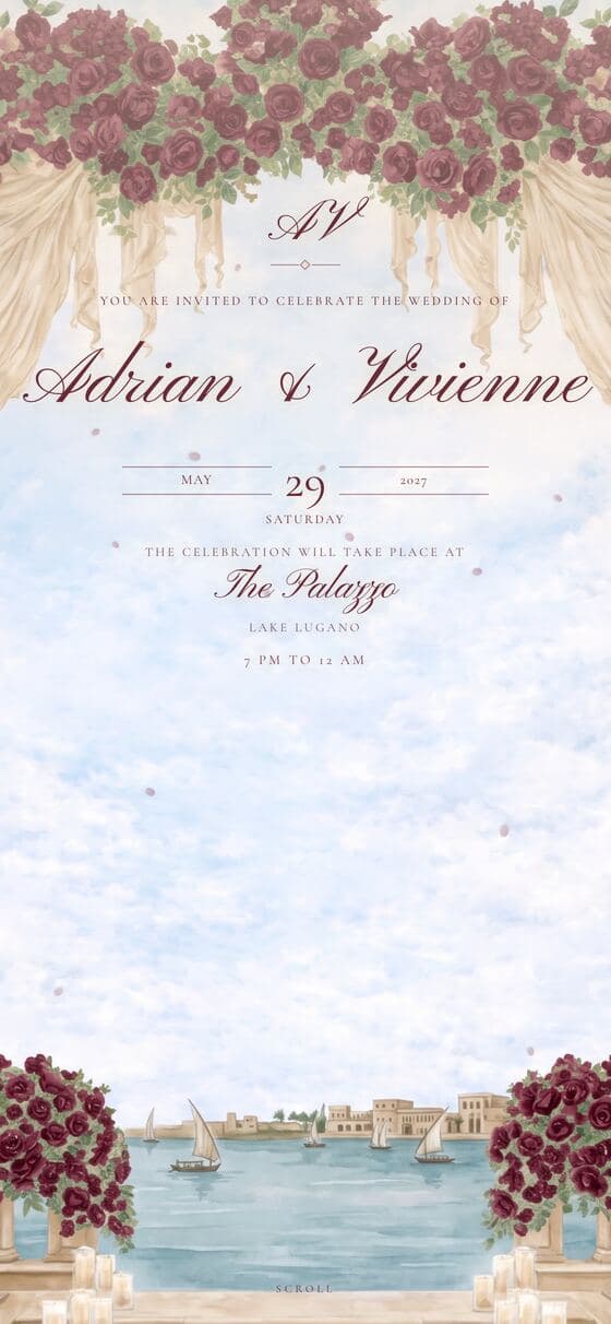
Formal · ballroom · burgundy
Velvet
Why it works: Deep burgundy against ivory gives an evening reception weight without turning the text low-contrast, which is where most dark wedding sites fail on a phone.
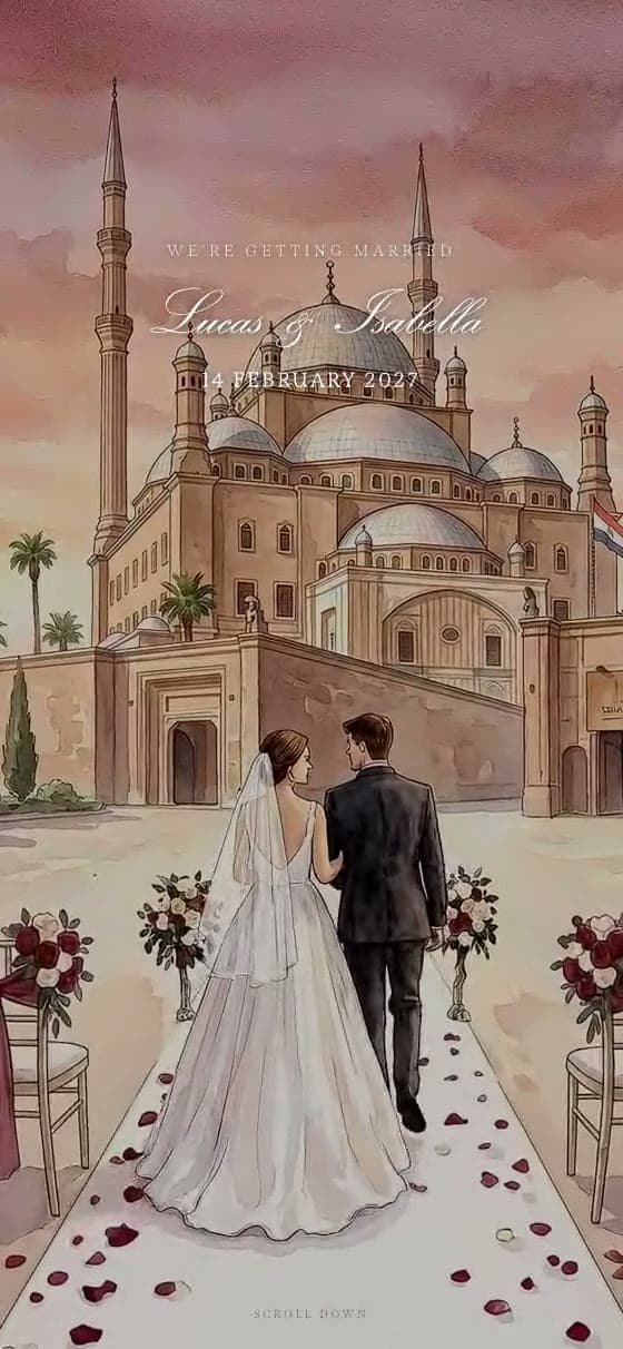
Belle Époque · courtyard · painterly
Riviera
Why it works: A painted ballroom hero does the decorative work, so the sections below can stay short: one venue, one schedule, one reply button.
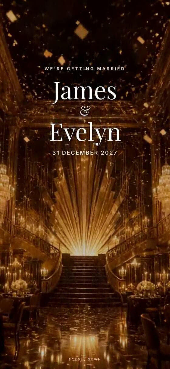
Art deco · evening · black and gold
Deco
Why it works: The first of the two dark designs here: gold geometry on velvet black, with ivory text kept large enough to stay readable. It suits an evening-only celebration where guests need the start time more than the story.
Garden and floral wedding websites
Painted and watercolour designs for a marquee, a country house or a garden ceremony. The test each one passes: the illustration never sits behind the words you actually need.
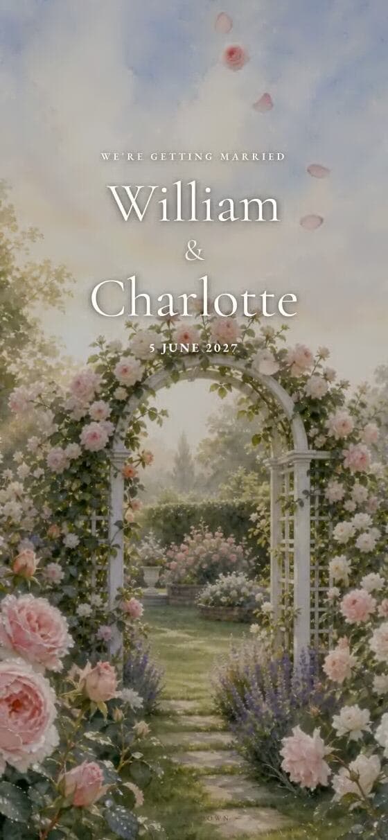
Floral · garden · romantic
Bloom
Why it works: Watercolour roses frame the page rather than fill it, leaving a clean central column for directions, timings and a relaxed order of the day.
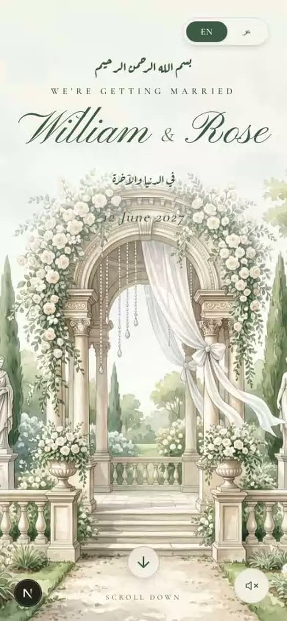
Painted garden estate · white roses
Gardenia
Why it works: Hand-painted columns and drapes give a plain venue a sense of occasion, which is useful when the photographs are not ready yet.
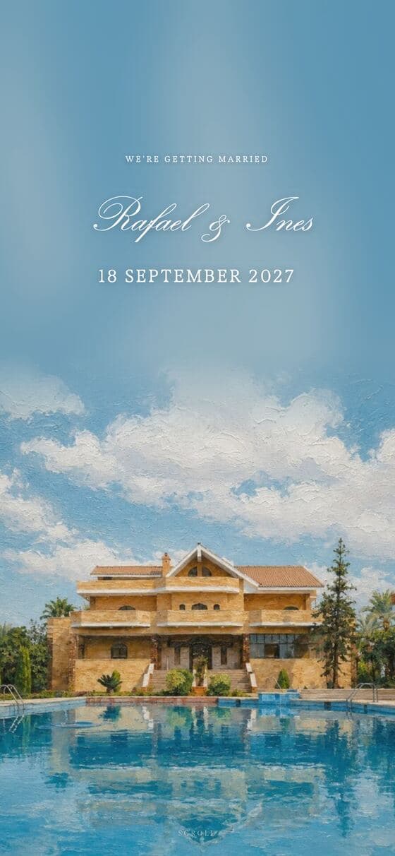
Painted estate · day to night
Laurel
Why it works: The illustration shifts from daylight to evening as you scroll, so a ceremony-then-dinner day reads as one continuous invitation.
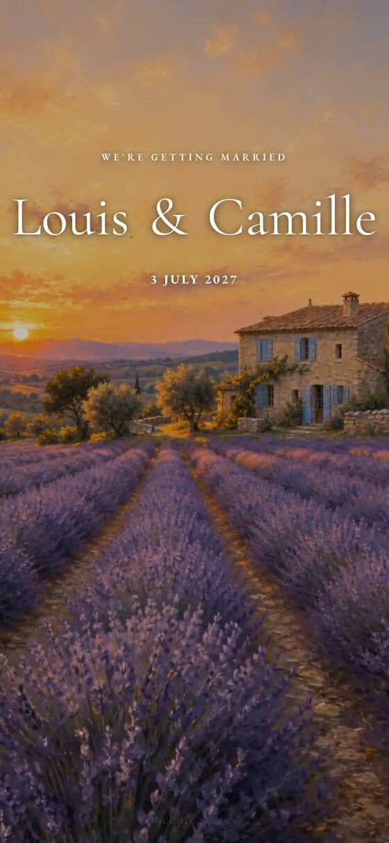
French countryside · lavender · linen
Provence
Why it works: Soft lavender and linen tones stay legible in bright sun, which matters when guests open the link standing outside the venue.
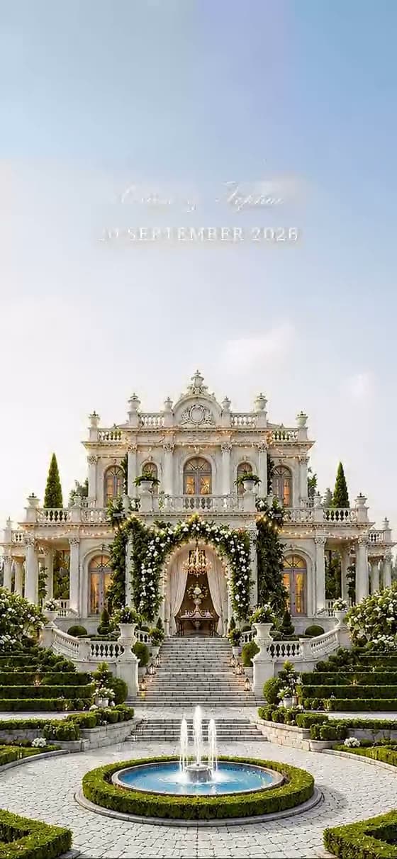
Watercolour · romantic · day to night
Twilight
Why it works: Warm, muted painting with high-contrast information cards — a good example of an atmospheric site that still answers where and when in two seconds.
Destination and travel wedding websites
If guests have to book a flight, the website stops being decoration and becomes the plan. These five give travel, accommodation and a multi-day schedule room to breathe.
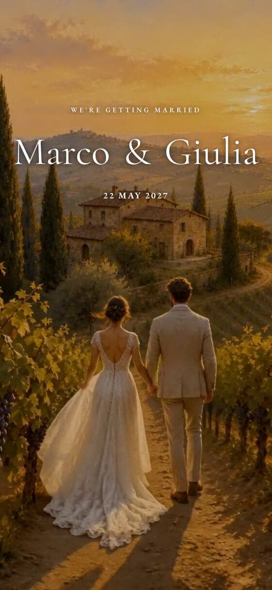
Destination · vineyard · golden hour
Toscana
Why it works: Built for a weekend rather than an afternoon: each hosted event gets its own dated row, with arrival airport and accommodation before the RSVP.
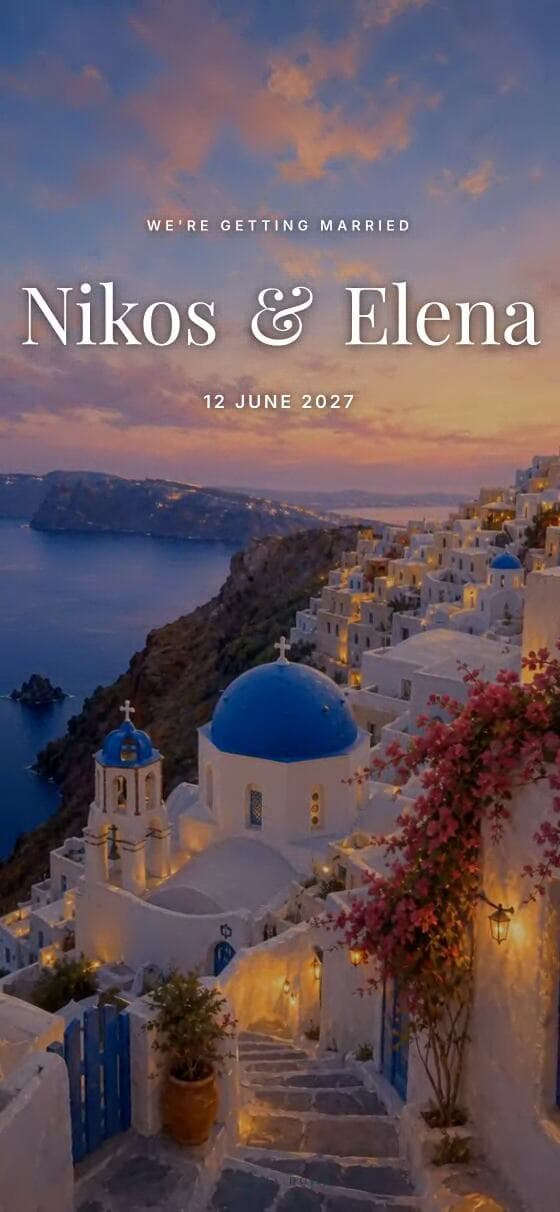
Greek island · coastal · bright
Santorini
Why it works: Bright and simple, so the travel guidance does not compete with the scenery. Useful when half the guest list is flying in from a different country.
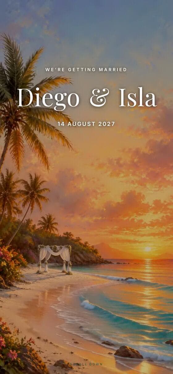
Tropical · relaxed · destination
Palma
Why it works: A relaxed tone that still carries hard logistics — dress code for heat, transfer times, and which events are hosted and which are suggestions.
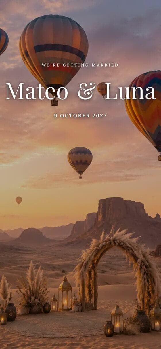
Desert · terracotta · warm dusk
Terra
Why it works: Terracotta arches and pampas suit an outdoor evening. The warm palette keeps long travel notes from looking like a spreadsheet.
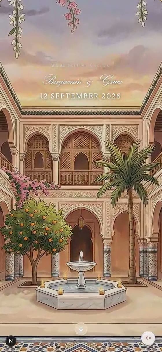
Courtyard · golden hour · mosaic
Lantern
Why it works: A courtyard setting with mosaic detail; strong for a multi-day celebration where several events happen at the same venue.
Calm and modern wedding websites
Quiet layouts for couples whose own photographs and wording should carry the page. These are the easiest to keep clear six weeks later, when guests come back to check an address.
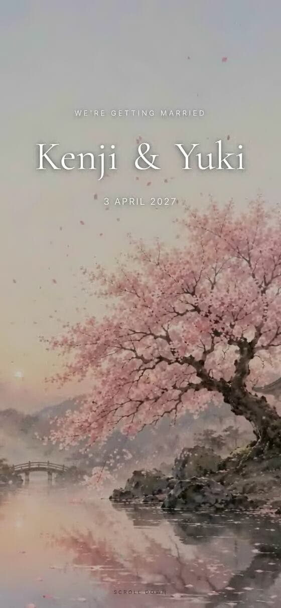
Minimal · botanical · calm
Sakura
Why it works: Almost nothing competes with the text. If your wording is the best thing you have, this is the example to copy.
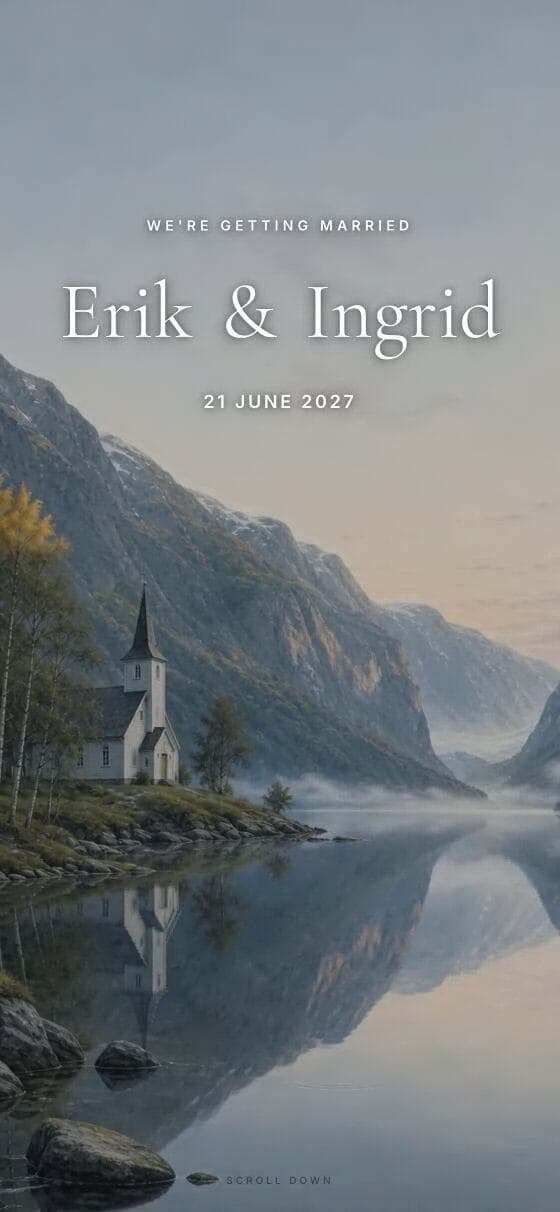
Nordic · minimal · pale light
Fjord
Why it works: Pale northern light and generous spacing. A good model for a small ceremony where the page is mostly practical information.

Northern lights · dark · cinematic
Aurora
Why it works: The second dark design, after Deco, and it shows how far you can take one: light text on deep blue, with every date and time kept at full contrast.
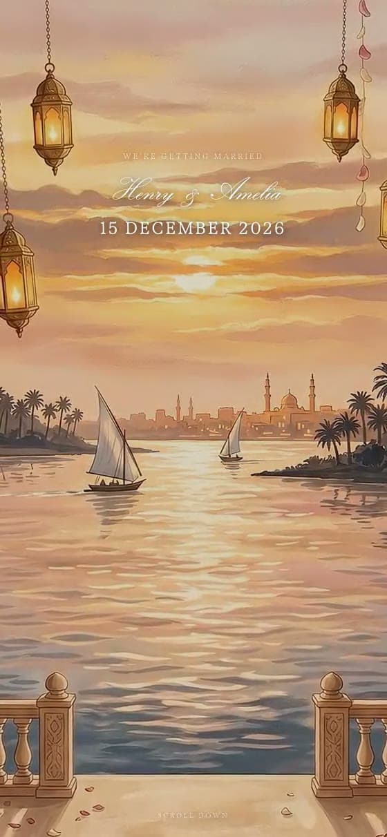
Painterly · golden water · warm
Sunset
Why it works: Golden reflections and scroll detailing give a simple structure some movement without adding another thing for a guest to read.
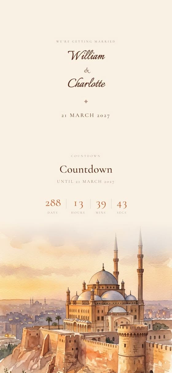
Soft peach · sage · daylight
Mirage
Why it works: The gentlest palette of the twenty. It works well for a daytime civil ceremony followed by an informal lunch.
All twenty run on the same engine, so the practical parts do not change between them: an animated envelope opening, optional background music, a venue map, a schedule, a photograph gallery and a built-in RSVP with a guest-messages dashboard. You send one link by WhatsApp, text or email, guests open it with no app to install, and you can edit the details after sending on the same link. The catalogue runs to more than 30 designs in 11 supported languages, including right-to-left Arabic, and a published invitation stays hosted through your wedding date and at least 90 days after.
Can these examples be used as a starting point?
Yes — that is the point of showing them live. Each of the twenty is a template as well as an example. Opening one puts your own names, date, venue, schedule, photographs and RSVP questions into the same structure, with the wording and the colours yours to change. Nothing is locked to the sample couple, and nothing about the layout is decided before you see your own text in it. To pick by template rather than by example, see wedding website templates.
The practical difference between a wedding website template and a design mockup is that a template has to survive real content. A long venue name, three events instead of one, a second language, forty photographs rather than six: all of that has to keep working. That is why the examples here are shown as complete running sites and not as cropped screenshots. Browse the full collection on our wedding invitation templates page, where each design has its own page with palette, best use and content notes.
How do you choose between these wedding website examples?
Start from the venue, not the thumbnail. A country house or garden sits naturally in Bloom, Gardenia or Laurel. A destination itinerary belongs in Toscana, Santorini or Palma. Royal, Imperial and Velvet suit a formal venue with architectural detail; Deco is strongest when there is an evening dress code to communicate. Sakura, Fjord and Mirage are the calm options when your own photographs and wording should do the work.
Then run the second-visit test. Open your two finalists on your own phone, scroll to the schedule and the RSVP, and imagine a guest coming back six weeks later to check the address. The design that is still clear on that second visit is usually the right one — which is rarely the busiest one. If two designs both pass, choose the one whose colours match the invitation you are sending, so the link and the card feel like the same wedding.
What should a wedding website include?
At a minimum: both names and the date on the first screen; the ceremony and reception venues with a map; the schedule in chronological order; an RSVP with a deadline; dress code; and one place to ask a question. Travelling guests also need the nearest airport or station, accommodation suggestions and a clear line between what is hosted and what is a recommendation. Anything sensitive — a home address, a registry note you would not say out loud — belongs in a message, not a page a guest can forward.
Write the practical parts in short sentences and put them under plain headings. A guest reading on a phone in a queue is scanning, not studying. Our wedding website page shows how the invitation, the details and the replies sit on one link, and the full content checklist gives you the wording for each section.
Best wedding websites: how do Zola, Joy, The Knot and Wedvite compare?
Short version: if a free wedding website is all you need, The Knot and Zola are hard to argue with, and Joy adds free digital cards on top. The catch is the invitation. Zola and The Knot do not sell a digital wedding invitation at all — both say so on their own help pages, and both offer a free digital save the date instead. If you want the invitation itself to be digital, that narrows the field to Joy and to us. Here is each service in turn, and then the four side by side in a table.
Zola
The website is free with unlimited guests, and the digital save the dates are free too — 1,895 designs of them. Zola makes its money on printed paper, a custom domain from $17.99 a year and two unpriced premium upgrades. It has no animated envelope, and its own FAQ states plainly that it does not offer digital invitations. Pick Zola if the plan is a free website plus paper invitations.
Joy
Joy's website, planning tools, registry and online RSVP are free, with unlimited guests, and its Basic digital cards are free with no minimum order. Two limits are worth knowing before you commit: the envelope colour and reveal animation belong to paid Premium cards with a 50-card minimum, and Joy-originated SMS is a paid add-on restricted to US and Canada numbers. A custom domain is around $19.99 per year and forwards rather than masks.
The Knot
The most straightforwardly free of the three: website, RSVP tracking, guest list and the messaging hub with no paid tier, no trial and no paid upgrade required. There is no animated envelope, and the free digital product is a save the date shared by text, email or QR code, not an invitation. A standard custom domain is $19.99 a year.
Wedvite
We are the paid row in the table below. $89 once, unlimited guests, no per-guest fee and no subscription; the invitation and the website are the same link, with the animated envelope, a music track, the venue map and the RSVP included rather than gated — your own song is a small add-on. We lose on price, we lose on the free tier — you can design everything free and share with your first 10 guests before you pay, and publishing to everyone is the paid step — and we lose it on custom domains, which we do not offer at all. We win on the one thing Zola and The Knot do not sell at all, and that Joy gates behind a paid Premium card with a 50-card minimum: an animated digital wedding invitation that is also the website, included in the price. For the wider field, including Squarespace, Wix, Minted and Riley & Grey, see our round-up of the best wedding websites with RSVP, and for British couples, the best wedding websites in the UK.
| Wedding website | Price for one wedding, 100 guests | Free tier | RSVP built in | Digital invitations included |
|---|---|---|---|---|
| Zola | Free digitally (no digital invitation sold) — paper from $184.99 | Yes — No hidden fees or hurdles to get started... The only exception is if you want a custom domain | Yes | No — digital save the dates only |
| Joy (withjoy.com) | Free ($0 via free Basic Digital cards + free website) | Yes — Joy wedding websites, planning tools, registry, and online RSVP are free! | Yes | Yes — free Basic cards; the reveal animation is a paid Premium card |
| The Knot | Free digitally (website + digital save the date); $199 paper list / $139 with WED30 | Yes — The free version of The Knot Wedding Website is fully functional and includes all core wedding website features without requiring a paid upgrade, subscription, trial period | Yes | No — digital save the dates only |
| Wedvite | $89 | Partly — design everything free and share with your first 10 guests; pay once to publish for everyone | Yes | Yes — the invitation and the website are the same link |